5 Ideas About Color
Recently, I was involved in a panel talk with artists participating in a show about color and light. Ideas about color in the paintings exhibited were shared, and I realized again that color is the area in painting that everyone from the artist to the critic, viewer or buyer has a strong opinion about. When someone says " I don't know much about art but I know what I like" they most often are talking about color. People are drawn to certain colors and really dislike others. Many people are afraid of making a "wrong" or "bad" color choice in their homes or clothing. I get asked pretty often to help people choose colors of paint or fabric. They usually know what they want, it can be validation that the colors work together."Generally speaking, color is a power which directly influences the soul.Wassily Kandinsky
1. Value does all the work, while color gets all the credit.
It's the underlying scheme of dark and light that allows a painting to be built well. Without a powerful idea of this structure, color is not able to carry the idea of the painting and be fully active. If you are Rothko, and your idea is to embrace or overwhelm your audience with pulsating color, you are still controlling the value first. Whenever I can remember this, I have a better painting.
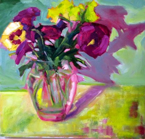
 |
| "Jackie's Washday" © Janet Ledoux 2012, oil on board, private collection |
2. Roll with the color wheel
 |
| photo © River Tree Arts |
Here is Norman demonstrating color wheel / painting comparison technique.
3. It's the context that defines color
All colors are influenced by the other colors nearby. Surround a modest yellow with shades of grey and it will glow as though it was florescent. Surround the same yellow with greens and it will appear chartreuse. One idea to make it easier to see the affect of your colors on the canvas is to get them all on there quickly, then you see what you have and can adjust the color based on the context.
4. Color as emotional expression
Color connects with people on an elemental emotional level. Painters might use a color just because of their own associations with that color. Viewers bring their own associations when they choose a painting when it just resonates with them on a purely emotional level. Color communicates.
5. Color is light
There is no such thing as color, really. It's a construct of your brain as it translates light hitting objects and bouncing prismatically back through your retinas. We all see this light/color a bit differently. Light is what you paint when you are working directly from a subject. It's expressed as color.
"Color and Light" is on view at River Tree arts in Kennebunk until May 23. more information and directions
Comments
Post a Comment